If you’ve been following my trading for a while, you’ll know that my bread-and-butter trades involve shorting overextended momentum stocks…
To me, there’s no better risk/reward in the options market than buying puts when charts get overheated, overcrowded, and overbought.
Why? Because when buzzy charts get overextended, they always crash back down to earth.
It’s not a matter of if … only when.
And right now — as the major indexes look to be topping out — it’s the perfect time to start looking for these types of setups.
But identifying the best of these short plays is easier said than done…
You’ve gotta know what bearish indicators to look for, then have the confidence to pull the trigger once you see them.
With that in mind, let’s talk about three common signs of overextended stocks that every Evolver should be on the lookout for…
RSI Above 70
The relative strength index is a momentum indicator that illustrates how ‘overbought’ or ‘oversold’ a stock is based on the volatility in price action over a certain period.
Theoretically, a stock’s RSI can read anywhere from 0–100.
But most of the time, the RSI tends to land between 30–70 on the vast majority of widely-traded stocks.
In general, an RSI below 30 is thought to be oversold, while an RSI above 70 is thought to be overbought.
So, when I see an RSI above 70 on a popular momentum stock … I’m on high alert for put-trading opportunities.
Add the 14-day RSI to the bottom of your charts and start paying attention to how it interacts with the overall price action…
I bet you’ll be surprised how accurate this indicator can be for identifying overextended charts.
Then, you can work on implementing the information you get from RSI into your own trading strategy.
Rising Price and Falling Volume
Newbie traders often see a rising share price and think one way — bullish.
But little do they know, a rising share price can actually be a bearish indicator on a chart when it’s coupled with another key metric…
If a stock’s average daily trading volume is falling while the share price is surging, that’s a huge red flag that means the stock could be headed for a major downturn.
How I Turned My 1st Hater Into A Millionaire
Think about it…
If a stock is ramping to the upside, that means there are more buyers than sellers.
And if the trading volume is soaring along with the share price, this means that each new day is bringing more buyers than the last.
But at some point, this balance flips…
If the share price continues to move higher, but you see the volume begin to fall off … that’s a sign that the rally is losing steam.
If the volume averages no longer match the bullish price action, the appetite for buying is quickly disappearing.
So, when a share price is steadily gaining while the daily trading volume is precipitously dropping — bulls should be cautious. And bears should consider getting aggressive.
Rejections at Key Resistance Levels
As a technical trader, watching key price levels is critical to my trading strategy.
And as a negative-biased trader, I’m often looking for levels of resistance — prices that a stock continually has trouble breaking (where it will likely be rejected again).
When I’m trying to determine key price levels, the first thing I’ll do is zoom out on a daily or weekly chart and see where the stock has continually failed.
If the chart fails at the same price level multiple times throughout its history, that’s a key level of resistance.
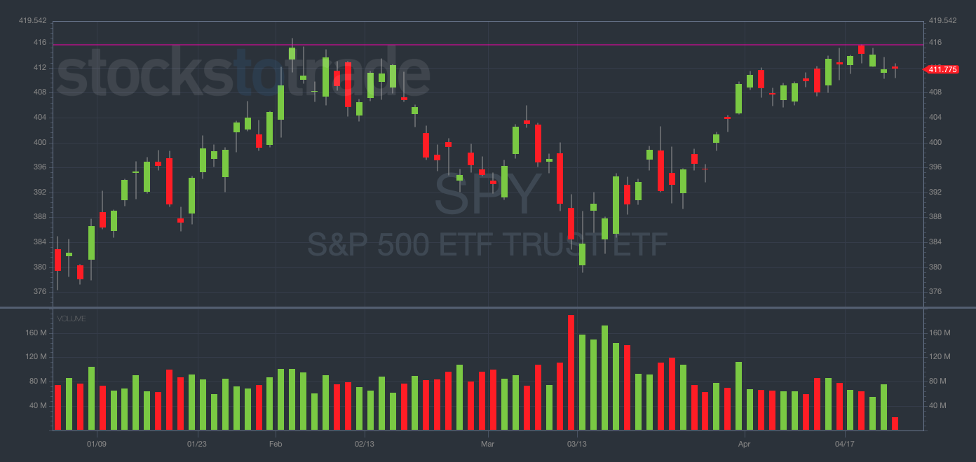
A current example of this is apparent in the SPDR S&P 500 ETF (NYSEARCA: SPY) daily chart…

SPY YTD daily chart — courtesy of StocksToTrade.com
In February, the SPY topped out around $415 … the exact same level the index struggled to break last week. (See the purple line.)
This is an example of a double top, a common way that key price level rejections manifest themselves, and another bearish indicator to look for when attempting to trade puts.
(These bearish technical indicators in the major indexes are the primary reason I’ve warned you about the possibility of the bear market rally ending soon.)
There are also some common levels of psychological resistance that can occur within a chart.
Oftentimes, these levels coincide with big round numbers like $20, $50, $100, $200, etc.
And if you think about this logically, it makes a lot of sense.
Traders are watching the same levels and setting limit sell orders around them, causing big dips to occur when the share price nears that level and the orders are triggered.
All this to say, identifying key levels of resistance is one of the most vital tools in a short seller’s bag of tricks. Start practicing!
Final Thoughts
These are just a few ways you can look to identify overextended charts.
Other methods may work for you, but these are the tools that work for me.
Watch for rejections at resistance levels, falling volume, and RSIs above 70 — then consider the opportune time to buy puts.


